Houzz Design System

Header
Project Overview
During daily design practice at Houzz, my teammates and I gradually realized that our existing design system was far away from perfect considering consistency, scalability, accessibility, etc. To improve the current UI, and establish a robust design eco-system, we started from research, clarified hierarchy, followed by iteration and then validated by testing & evaluating.  In this project, I was working with the other 2 designers as a squad and collaborating with the front-end team, branding team, mobile team, etc. to make sure our design system was able to serve as many circumstances as we could think of.
Project Type:  Design System
Role:  Visual, UX, Research
Duration:  Nov. 2019 - Mar. 2020
Tool:  Figma

Problem & Goal

Problem - "Where is the current design system not doing well?"
Houzz is a unique platform with a mixture of idea-collection, e-commerce, and service providing. However, this “One-stop-shop“ business model is also challenging its old design system as it’s unable to fulfill a full spectrum of use cases. Here are 3 main problems from my research.
Problem 1
Problem 2
Problem 3
Goal - "What is the ideal case?"
Building a design system is never as simple as creating a set of UI components. As a matter of fact, it’s more like composing a philosophy that could empower efficiency, enhance the user experience, and more importantly, present a company’s design belief. At that moment, the first thing to be considered for us was figuring out what an ideal design system should look like.
Goal

Vision & Planning

Anatomy - “Is there an easier way to understand the task?“
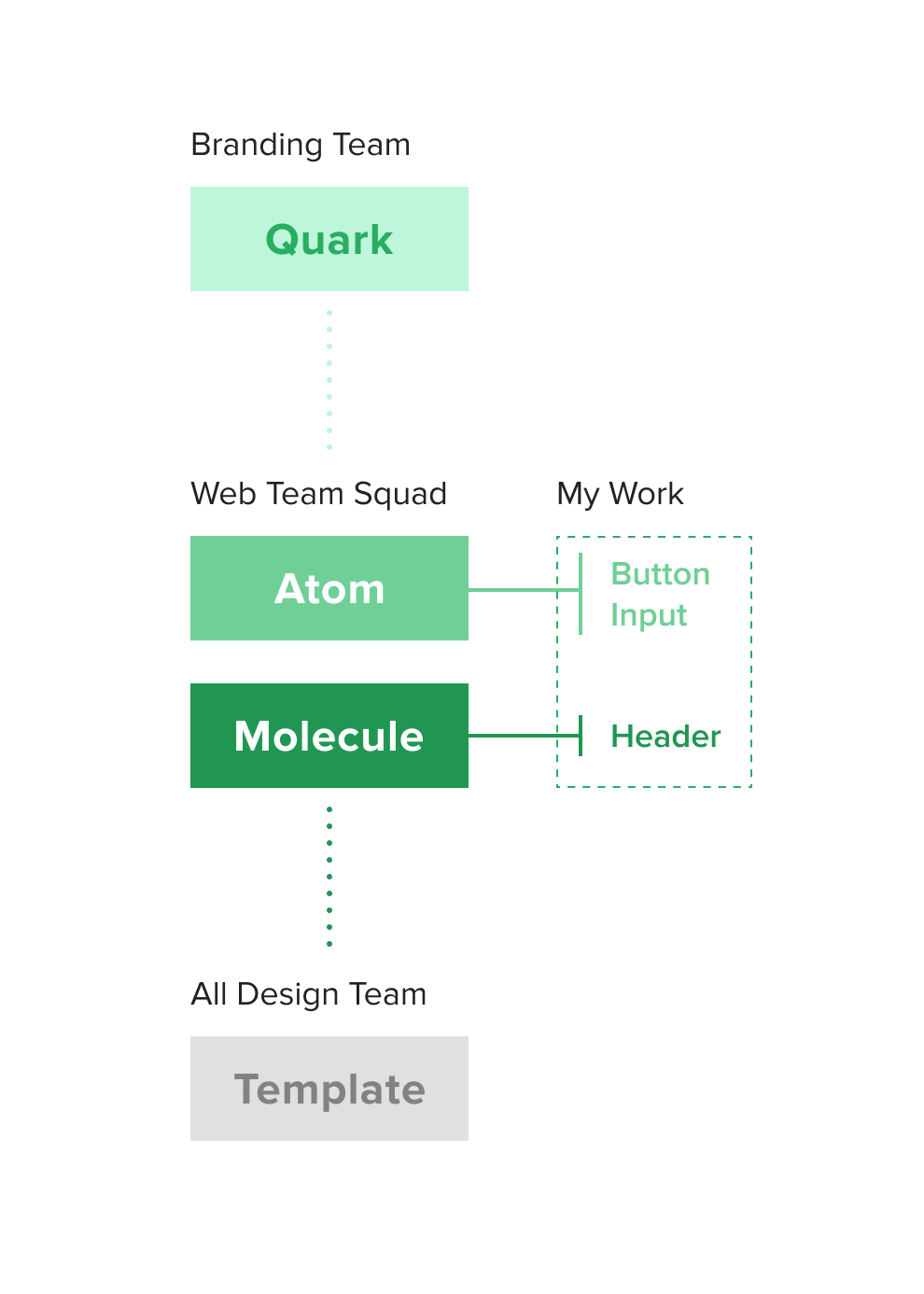
As mentioned above, rebuilding a design system could easily turn into an overwhelming task, especially with different stakeholders engaged. To set up a holistic view before diving into details, three of us started scoping the vision by using the “Particle” metaphor. We decided to categorize all components into 4 tiers: Quark -> Atom -> Molecule -> Template.
Information Architecture - "How to cut the whole cake into pieces?"
As shown below, we clarified the role of all components and categorized them into these 4 tiers, which provided us a clear roadmap to advance. Since there were only 3 of us in the squad, we decided to assign these objectives to ourselves by voluntary picking.
Teamwork - "Who's going to do what?"
Building a design system is an organic and systematic work, which requires nearly the entire design team’s effort. To reach maximum efficiency, we were seeking collaboration with other teams and taking charge of different parts individually. As for myself, I selected “Button”, “Input“ and “Header“ as my share. In the next chapter, I will zoom into these 3 components and specifically share my development process.

Design Process

Design Roadmap - "How to move forward step by step?"
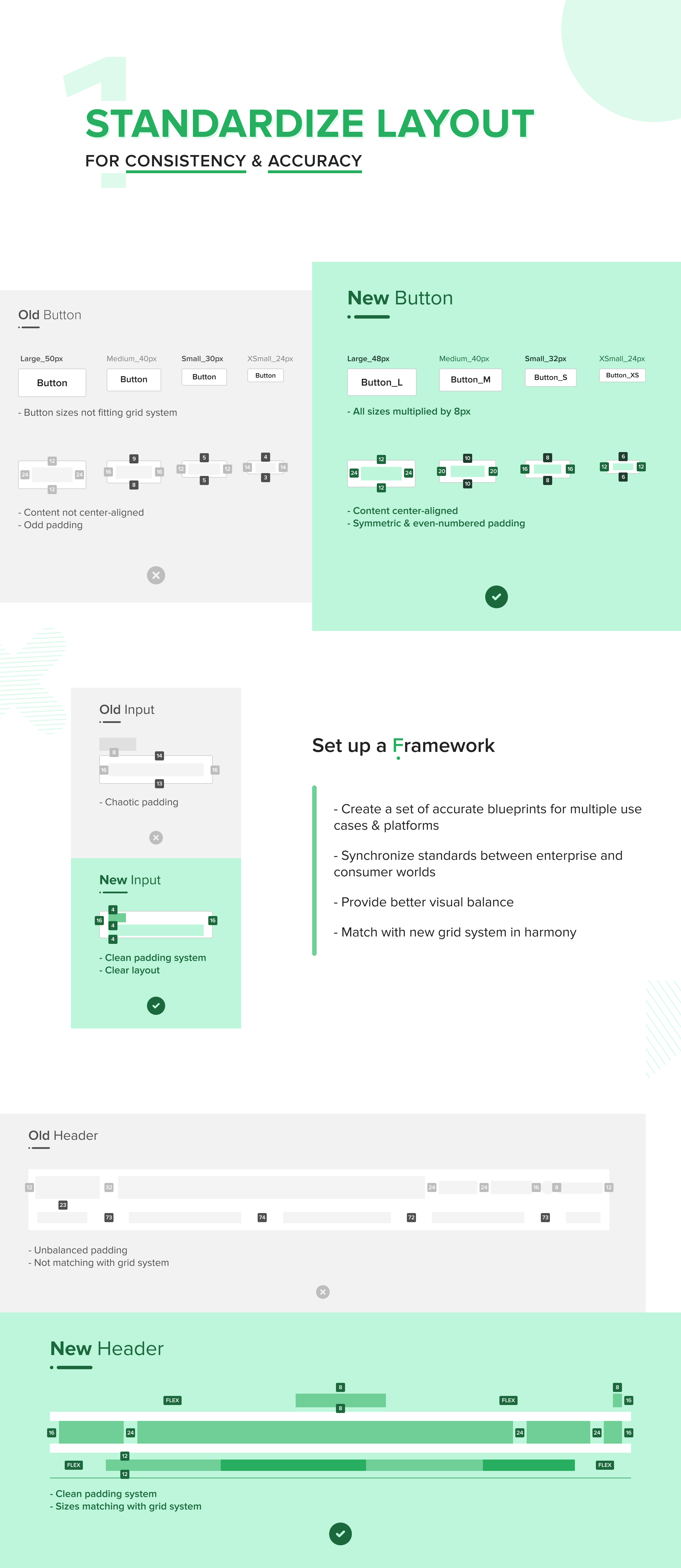
Since the roadmap had been settled, we were ready to enter the design chapter. With the 3 recognized problems: “Consistency“, “Coherency“, and “Scalability“ in mind, I decided to take 4 main steps to perform the best solutions for Button, Input and Header.
Design Roadmap
Design Step 4 - Auditing & Testing
Until this moment, we had established a prototype of the new design system consisting of layout, style, state & interaction. Then it was time to improve it with more feedback. The auditing & testing had started from the early stage of our design process. Among different design phases, we collaborated with multiple teams to evaluate and optimize components along with three aspects: Usability, Accessibility & Feasibility.
Audit 1
Audit 2
Audit 3
Audit 4
Audit 5

Final Outcome