Copilot Skill Builder

Banner
Project Overview
CoPilot is SAP's new generation of digital assistant, similar to Siri or Alexa but more focused on business scenarios. Such an intelligent AI requires an equally powerful tool to function at full speed. CoPilot Skill Builder is a chatbot building platform that empowers multiple roles to create, configure, train, test, and implement skills for CoPilot with minimal coding. In this project, I collaborated with 2 other UX designers, 1 UX researcher, and 1 UI designer from early-stage concept design to hi-fi deliverables for development cycles.
Project Type:  Product Design
Role:  UX, UI, Research
Duration:  Apr, 2017 - Mar, 2019
Tool:  Sketch, Framer, Invision, Keynote, Photoshop

Research

Timeline - “How will different tracks be maintained in parallel?“
Like all other projects, before jumping into the nitty-gritty, we first needed to come up with a high-level timeline. Shown below is how we managed to conduct multiple types of work- Research, Design & User Testing in parallel.
Timeline
Research - “What does the user need?“
With the basic understanding of chatbot building, now it was time to get closer to our end users. Collaborating with the research team, we conducted various approaches to acquire users' needs and pain points.
Comparative Analysis
15 Bot Building Tools
Research 1
Workshop
20 End Users
Research 2
Expert Interview
5 Domain Experts
Research 3
Contextual Inquiry
2 Observation Sessions
Research 4
Brainstorm
20+ Idea Cards
Research 5
Wireframe Validation
4 Stakeholders
Research 6
User Archetype - "Who's our target user?"
Through our user research, the first outcome that we came up with was the User Archetype, which reveals multiple user groups, their roles as well as their needs for this product. As a result, we categorized all users into three main buckets: Light, Medium & Heavy. Contradictory to our previous assumption, our research indicated that in over 99% of use cases, it is the developer who takes on the responsibility of building a chatbot from the beginning to end. So we decided to switch gears and prioritize the needs of the developers.
User Flow - “What does the user journey look like?“
Another finding from our research was the User Flow. With so many steps involved, building a functional and intelligent chatbot isn't as simple as it might look like. From dozens of conversations with stakeholders, we managed to chain all fractions into an end-to-end story including configuring, publishing, monitoring, etc.
User Flow

Design

With target users and task flows marked out, we proceeded to the design phase following design-thinking sequences. Most people may think that the design process is pretty straightforward: Receive requirement - Draw UI - Deliver Specs. However, as UX designers, we always regard product design as an iterative journey instead of a linear procedure, which means we have to commute between assumptions and validations all the time. So in this phase, we invested a huge amount of time on both WHAT(which screen we need to consider) and HOW(how these screens should appear) to ensure the final design meets the user's needs. Here are some key steps of how we conduct this process from the backbone to the surface.
Information Architecture - "How does the systems structure look like?"
The first thing that we did in the design phase was clarify the hierarchy of the whole skill-building eco-system by creating this Information Architecture diagram. Skill builder is such a complex and organic system that it will never be self-explanatory until being somehow visualized. To add to that, IA is essential as it would not only reveal what was ahead of us but also trigger our thoughts for task flow.
IA
Hand Sketches - "What possibilities are out there?"
As a part of brainstorming, all designers on the team drew Hand Sketches to quickly depict our ideal mental models. Then, we discussed everyone's ideas and picked the best practices as starting points for further iterations.
Sketch 1
Sketch 2
Sketch 3
Wireframe - "From where to where?"
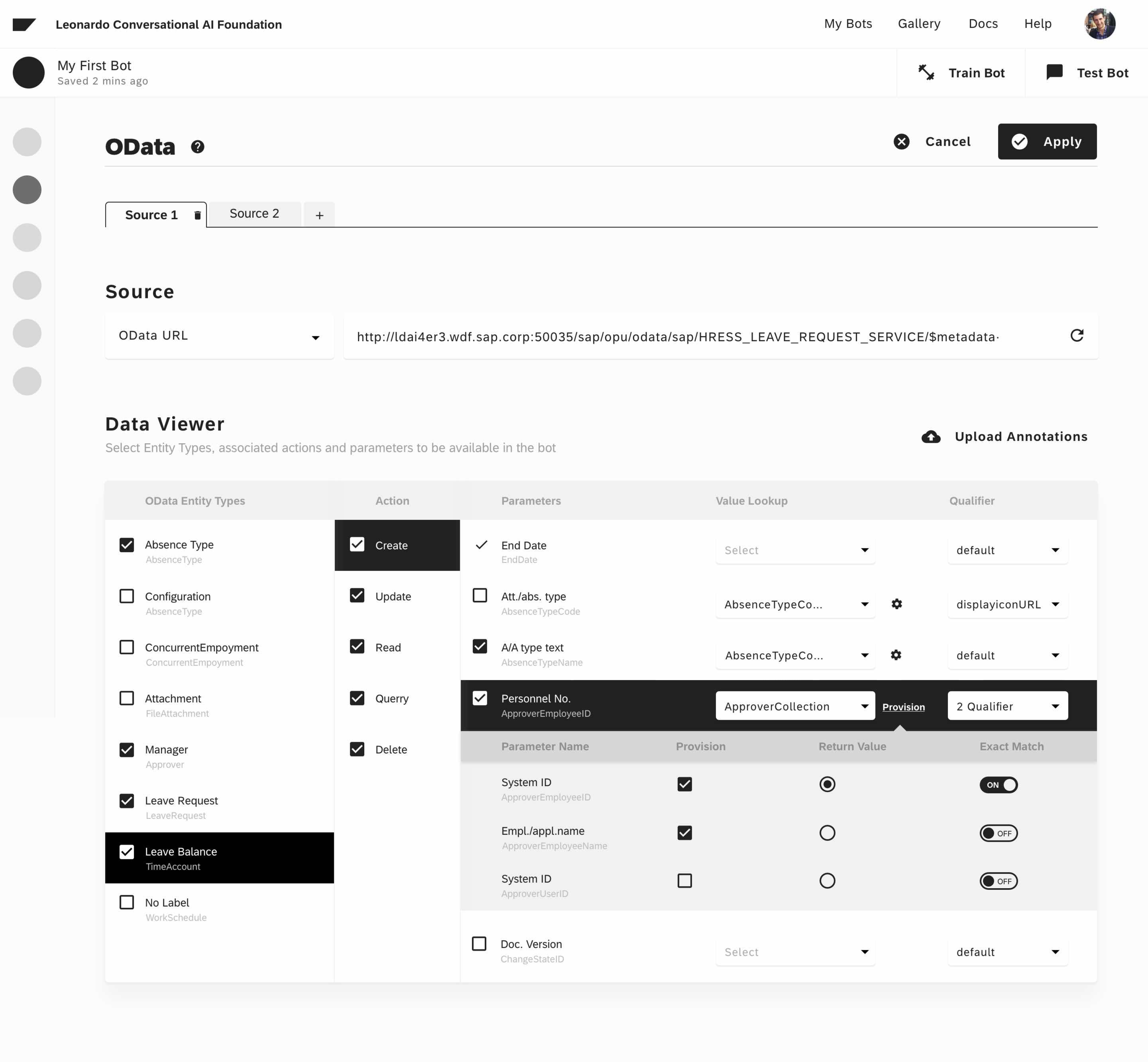
Wireframing was another activity we used to proceed from concepts to design. In this step, we created wireframes to clarify screen content and task flow. Below is an example of a wireframe I created for Create New Skill by using OData Web Service.
Wireframe
Page Layout - "How about zooming into each page?"
For Page Layout, we focused on the structure and information flow instead of detailed content to set up the skeleton.
Layout 1
Layout 2
Layout 3
Layout 4
Layout 5
Layout 6
Lo-fi Concept - "How about taking it one step further?"
With flow and structure in mind, I created these Low Fidelity Concepts with more details. In this step, I grayed out all screens to eliminate any potential bias caused by visual attraction. We also presented this V1.5 design to users and stakeholders to validate some key features.
Visual Exploration - "What tone to apply?"
After we completed the task flow, it was time to set the tone for visual language. At this time, we worked with the visual designer and conducted a series of exercises to finalize the theme. One of the exercises we came up with was creating visual keywords by voting for random pictures found online.
Hi-fi Design - "What is the final look of the product?"
Hi-fi 1
Hi-fi 2
Hi-fi 3
Hi-fi 4
Hi-fi 5
Hi-fi 6
Hi-fi 7
Hi-fi 8
Video Demo - "How to interact with the system in real-time?"

Deliver

Release Lifecycle - “How do we turn the design proposal into a real build?“
So far, we had worked directly with the Dev team and PO for almost a year through 4 successful releases. The success factor of such an effective collaboration was trying to keep everyone in the loop from research to development. It was very challenging to keep Palo Alto and Bangalore synchronized, but we figured it out by establishing a series of robust communication patterns such as weekly sync-ups, live comments, and in-person workshops, etc.
Release Lifecycle
Collaboration Pattern - “How do we work with the engineering team?“
To maximize the efficiency of the collaboration between the design team and engineering team, we created InVision prototypes to help illustrate the design proposal. The engineering team located in India would leave comments on the prototype overnight. Then on the next day, the design team would review these comments together and conduct iterations accordingly. Meanwhile, we were also using Invision for detailed specs of each key screen, including all contents, states, layouts, and appearances.
Collaboration 1
Collaboration 2
Collaboration 3
Add-on Features - “What makes the system more user-friendly?“
First-time Onboarding
Add-on Feature 1
Take a Tour
Add-on Feature 2
Error Handling
Add-on Feature 3
In-app Help
Add-on Feature 4
Code Playground
Add-on Feature 5
Testing Automation
Add-on Feature 6